DATA VISUALIZATION
Transforming Data Into Clear and Insightful Visual Stories
Data visualization transforms complex information into clear, intuitive visuals that support understanding and decision-making.
The geometric, structured aesthetic represents how dashboards and charts bring order to datasets—highlighting the patterns and insights that matter.
This section showcases dashboards, visual stories, and analytical graphics designed to communicate insights effectively and efficiently.

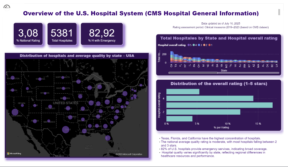
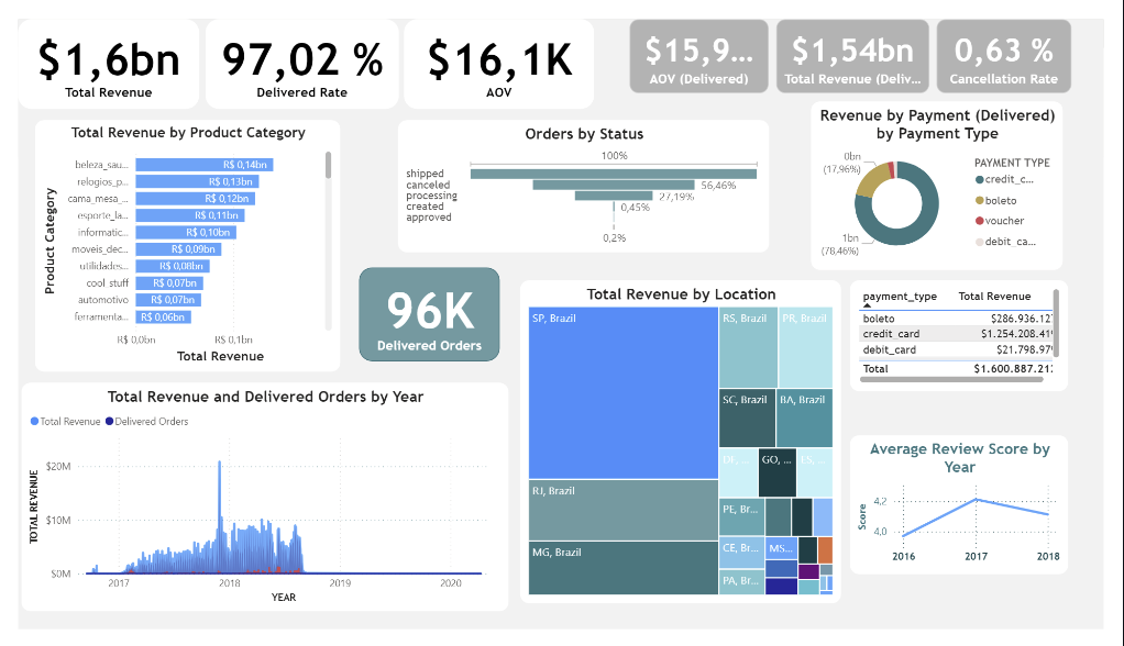
Turning Data into Visual Stories.
These projects focus on transforming raw data into clear, compelling visual stories using Excel and Power BI. The goal is not only to build dashboards, but to design visual narratives that help stakeholders quickly understand performance, trends, and opportunities.
Through careful layout, color choices, and KPI definition, each project emphasizes clarity, usability, and business relevance.
Visualizations are built to move from data exploration to insight, turning complex datasets into structured, actionable views that support decision-making.